UI/UX Updates: Homepage and Lesson Page

by BrainStream Chief User Experience Officer Yung-Wen Cheng
I am excited to share with you and our viewers the new UI/UX designs for BrainStream’s homepage and lesson page. I’ve done some major changes to the original design, making sure BrainStream feels more like a proper, interactive learning hub.
Enhanced Content Discovery
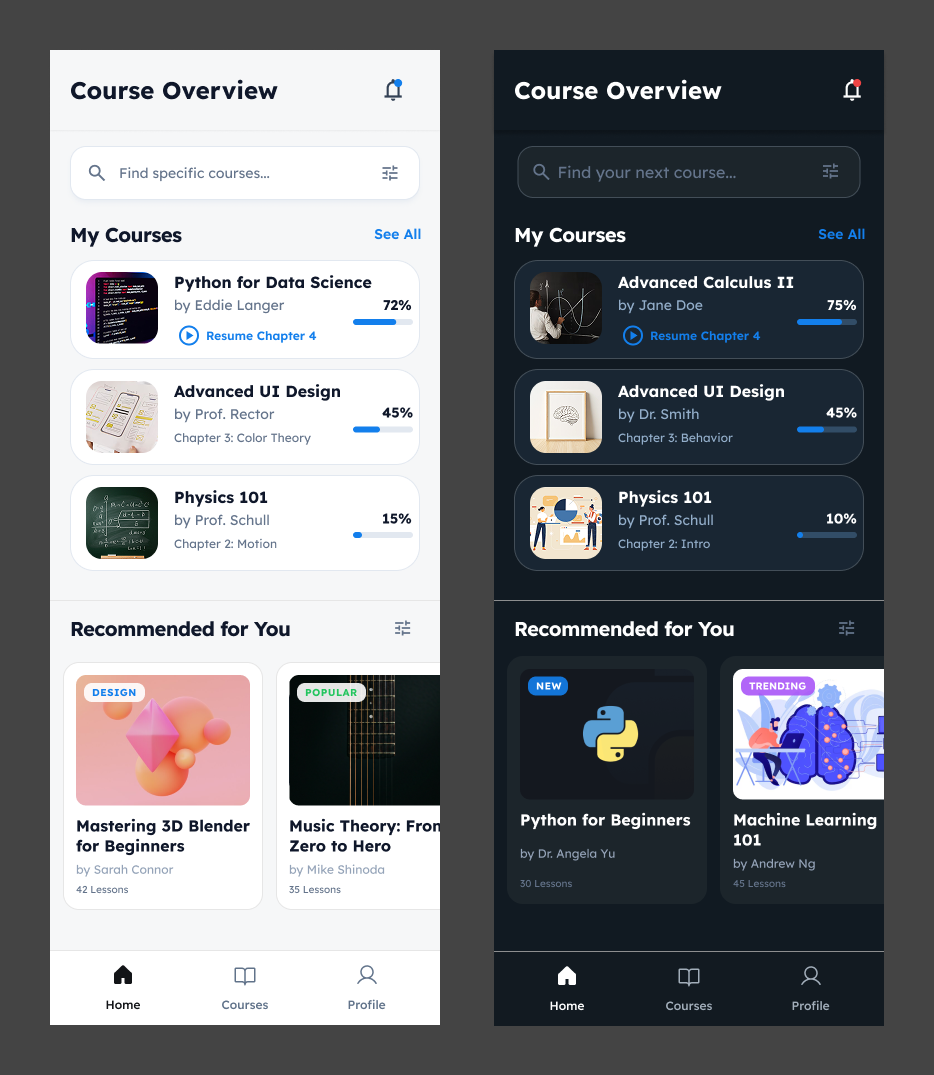
The new “Home” tab (formerly “My Courses”) now offers a far more engaging dashboard. Instead of simple book covers, courses are displayed with rich metadata like progress percentages (“72%”), specific chapter resume points (“Resume Chapter 4”), and instructor names directly on the card. The tabs help students pick back up where they left off instantly, rather than navigating through menus.
Improved Navigation & Search
The new homepage now has a search bar with filter controls, as students enroll in more courses, finding specific content quickly becomes essential. The “Recommended for You” section with “New” and “Trending” tags encourages continuous learning and exploration.
Rich Learning Context
The new lesson page now has tabs for Transcripts, Notes, and Quizzes, whereas the old UI just had a block of class info. The new “Key Takeaway” callout box and specific formula highlights simplify hard and difficult concepts, making complex information easier to digest and review.
Deeper Instructor Engagement
A major addition is the dedicated “About the Instructor” section in the new lesson view. This page highlights the educator’s credentials (PhD, affiliations) and lists their other courses. Students can also reach out to the instructor through the methods of communication provided by the instructor.
The new design shifts from a static content viewer to a dynamic, student-centric learning ecosystem, turning BrainStream into a comprehensive, guided learning environment that actively supports student progress and engagement.