The Impact of Colors on Learning App Design

by BrainStream Chief User Experience Officer Yung-Wen Cheng
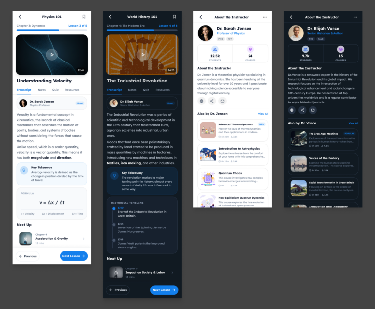
Color plays a powerful yet often underestimated role in BrainStream’s app design. Thoughtful application of color theory can significantly influence how students interact with and absorb information on a learning platform. When used strategically, colors can enhance focus, reduce eye strain, guide user attention, and even impact mood and motivation.
For learning environments, calm and non-distracting color schemes are generally preferred. Blues and greens are ideal base colors—they promote focus, reduce stress, and create a sense of stability. Soft blues can be used for backgrounds, while greens work well in areas where concentration and reading are required. Accent colors such as yellow or orange can highlight interactive elements like buttons or notifications, as they stimulate mental activity and draw attention without overwhelming the user.
Neutral tones such as off-white, light gray, or beige are also essential for balancing the interface and preventing visual fatigue. Importantly, high contrast between text and background improves readability and accessibility for all users.
Ccolor consistency and accessibility should also be considered—using color not just decoratively but functionally, to indicate status changes, group related elements, or convey feedback. In well-designed learning apps, color does more than decorate—it supports and enhances the entire educational experience.