
by BrainStream Chief User Experience Officer Yung-Wen Cheng
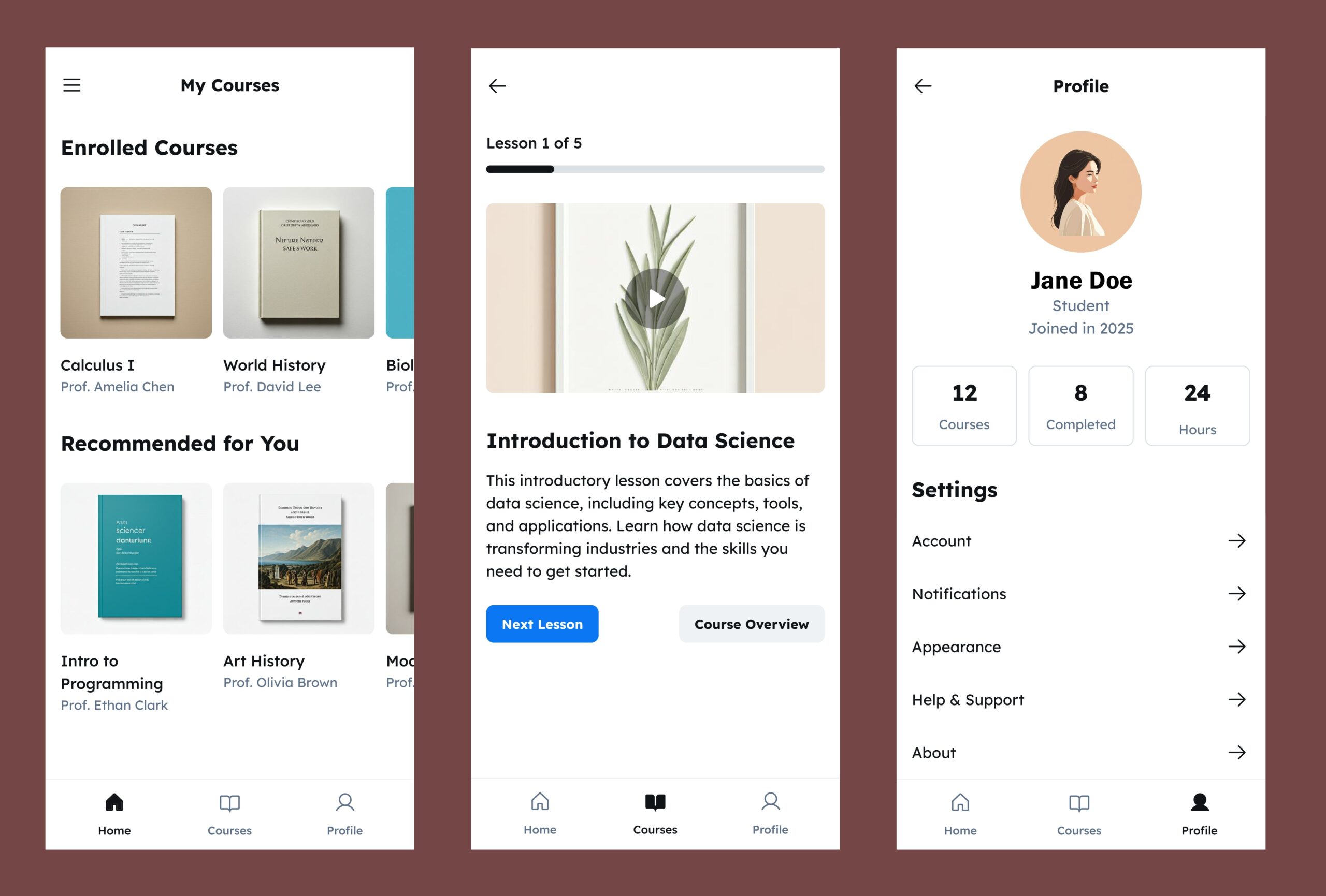
In today’s mobile-driven world, designing with a mobile-first mindset is essential for apps aiming to support modern students. Smartphones have become the primary tool for communication, study, and productivity, making mobile accessibility a cornerstone of effective educational design. However, mobile-first UX is not only about fitting content onto smaller screens—it’s about rethinking how students interact, learn, and progress across diverse subjects and learning activities.
A mobile-first approach begins with prioritizing essential functions. Dashboards should deliver key insights—such as progress summaries, upcoming deadlines, and performance alerts—clearly and efficiently. Interactive elements must be touch-friendly, responsive, and easy to navigate, while maintaining fast load times and stability across various devices and network conditions.
Yet, the type of subject and learning activity deeply influences interface design. Courses in language learning or business studies often rely on reading comprehension, multiple-choice assessments, or essay-style inputs—all of which adapt relatively well to mobile interfaces. In contrast, disciplines such as mathematics, physics, and chemistry involve complex problem-solving, equations, and diagrams that may not be easily managed on small screens.
To address this, we should consider adaptive design strategies that adjust tools and layouts based on subject type. For example, math-based modules might benefit from built-in formula editors or stylus support, while language learning sections could integrate audio recording and speech recognition for pronunciation practice. Meanwhile, responsive design should ensure that complex visual materials—such as graphs or scientific diagrams—can expand, zoom, or rotate for improved legibility.
Moreover, the experience should remain seamlessly consistent across devices. A student might review concepts or watch short lessons on a mobile phone but prefer completing intensive exercises on a tablet or desktop. Synchronization between devices ensures that progress, notes, and feedback follow the learner wherever they study would be as important.
Ultimately, mobile-first UX design for BrainStream must strike a balance between convenience and capability. It should empower students to learn anytime, anywhere, without sacrificing the depth and integrity of the learning experience. By recognizing the unique demands of different subjects and adapting the interface accordingly, designers can create an inclusive, effective, and truly student-centered mobile experience.